CASE STUDY

Civic AI Kiosk Assistant

A public-service kiosk experience designed for accessibility, from idle state to voice-and-text assistance, with clear touch controls and readable interaction patterns.

Role Product Designer
Focus Civic AI UX
Tools Figma
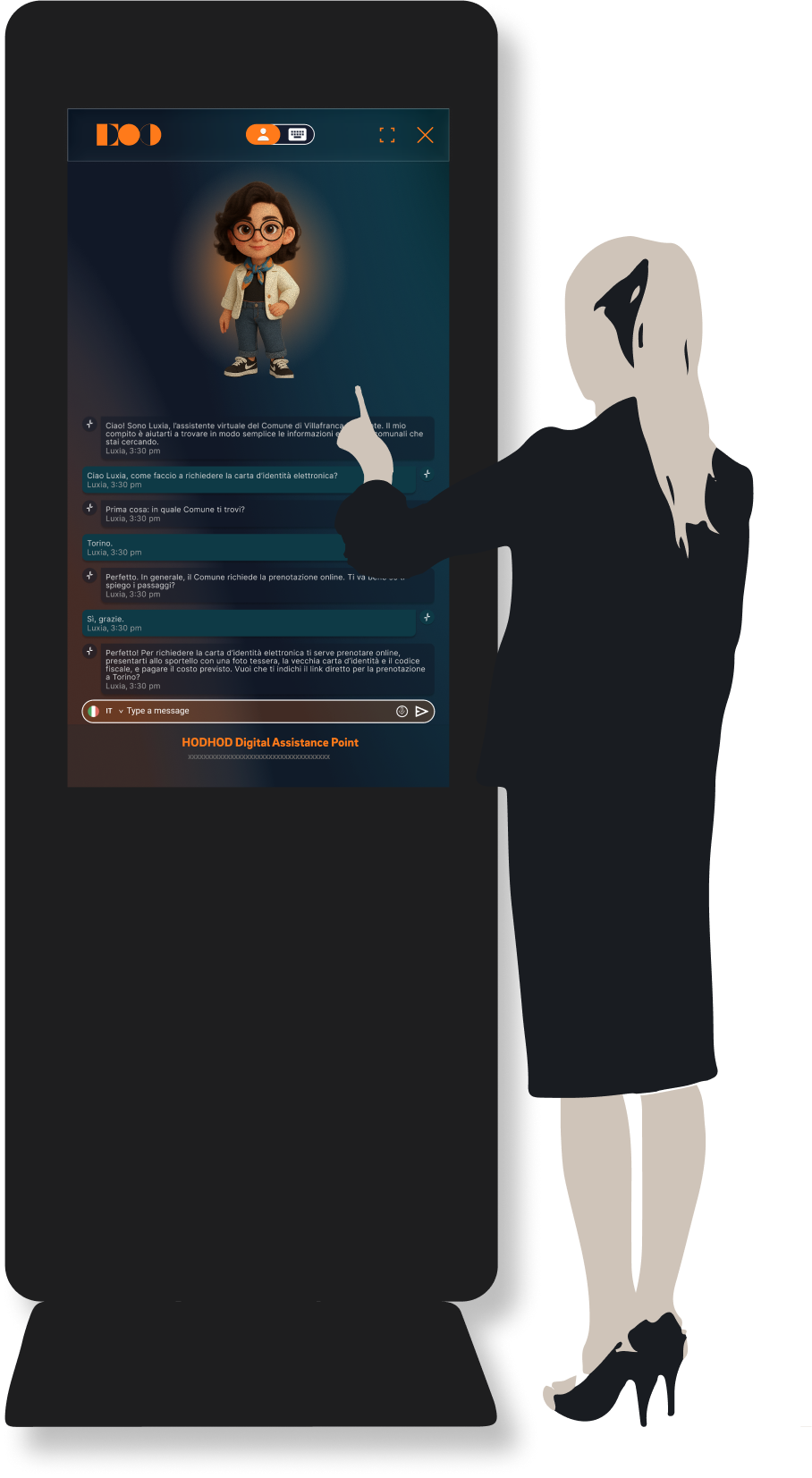
Civic kiosk assistant concept

Project Context

Civic support for real-world public touchpoints

This assistant was designed for public-service environments where people may need quick, practical information with little familiarity with the interface. It needed an obvious way to start, readable content, and a short path that still works for different levels of digital confidence.

The UX Challenge

Simple interactions for a broad audience

  • Create a clear idle state that invites interaction
  • Make the start action immediately understandable
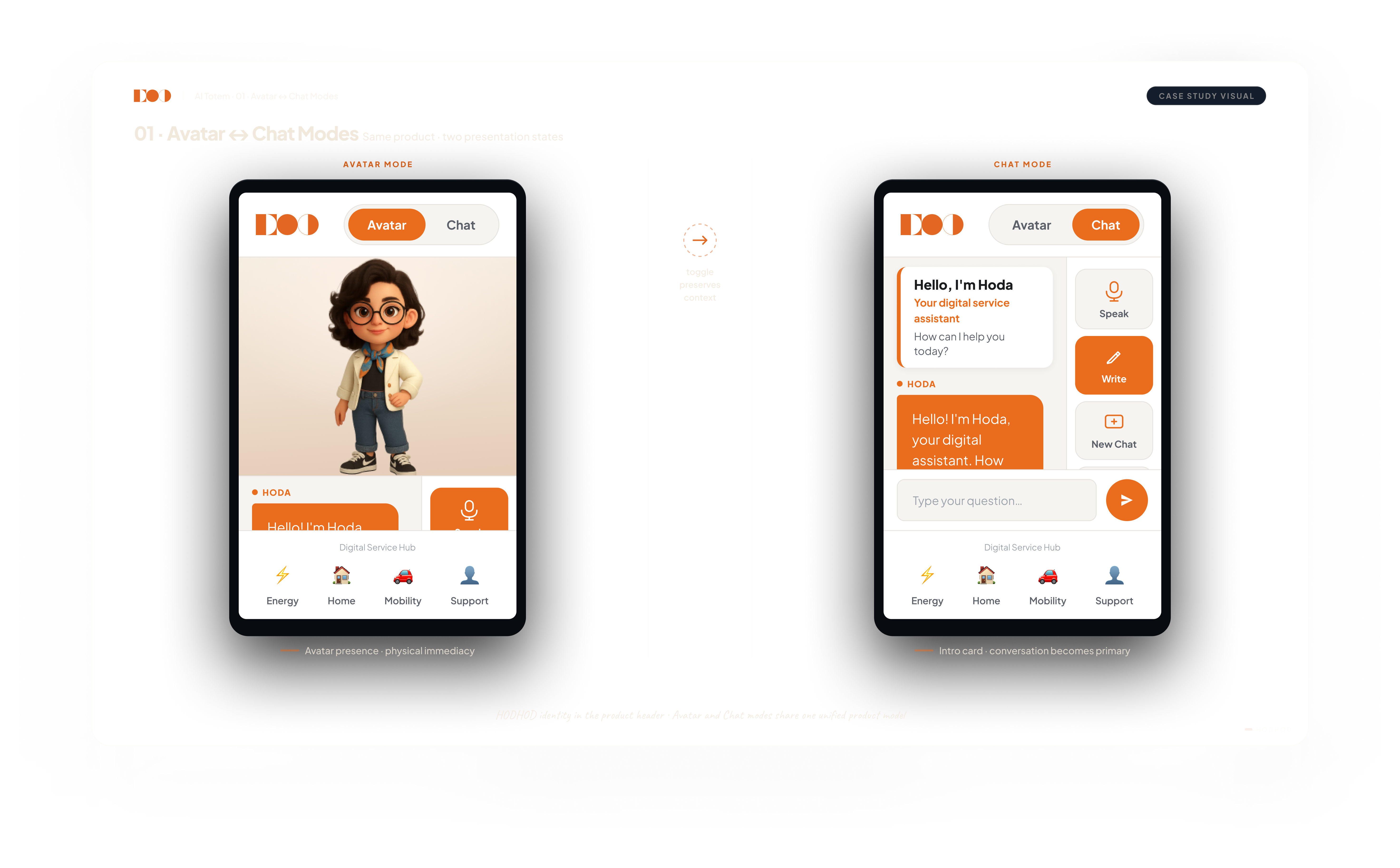
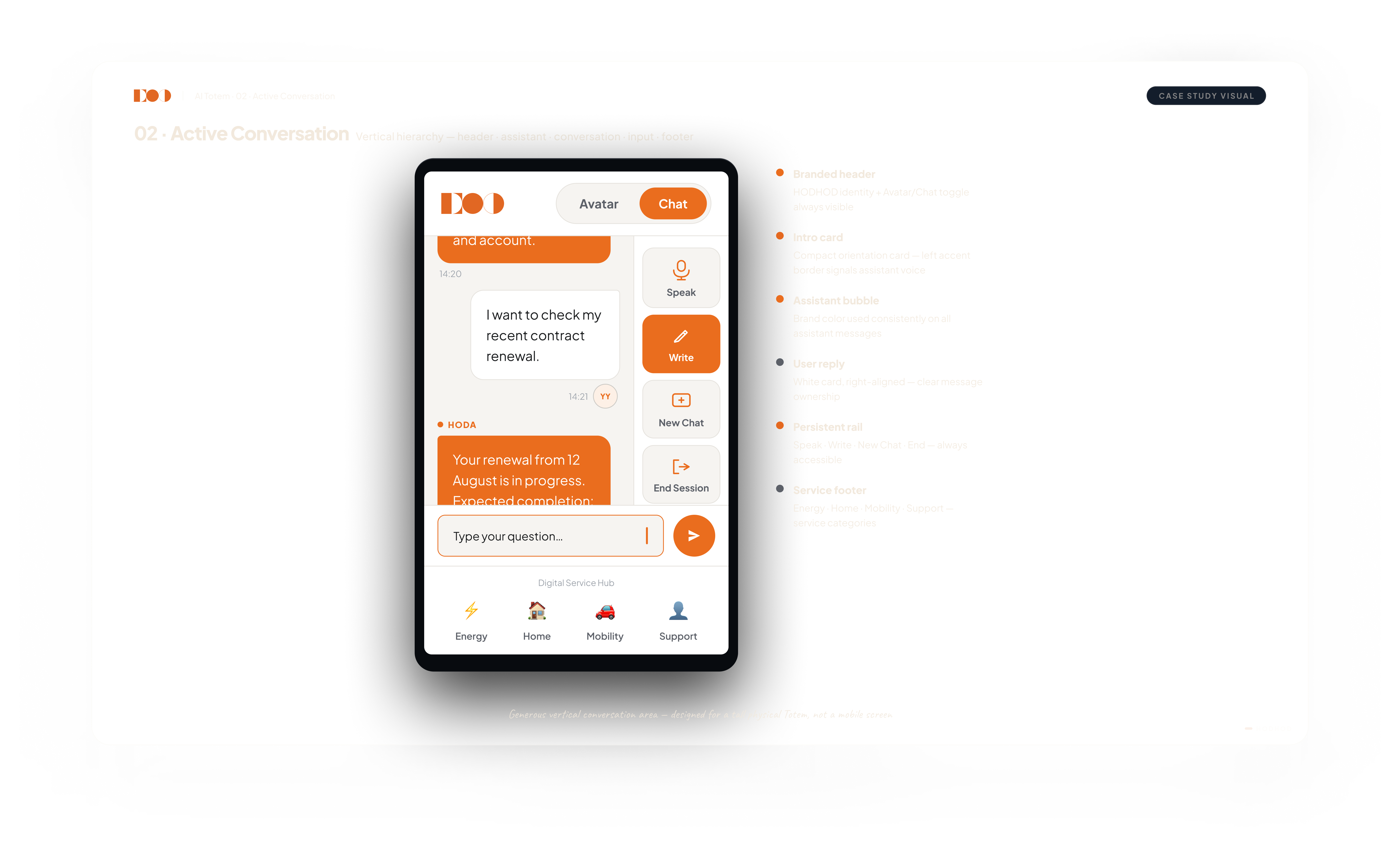
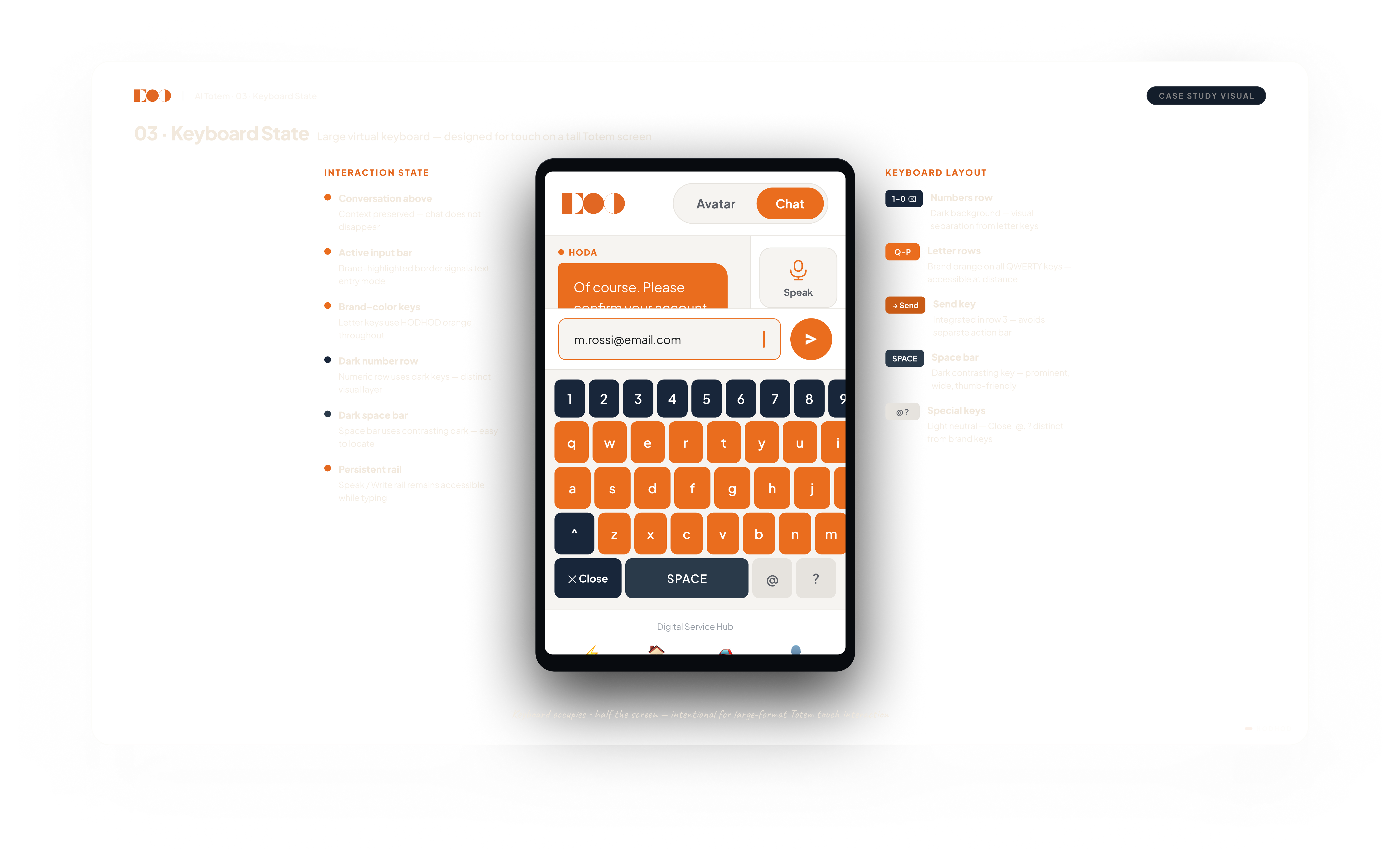
  • Support voice and text within one coherent journey
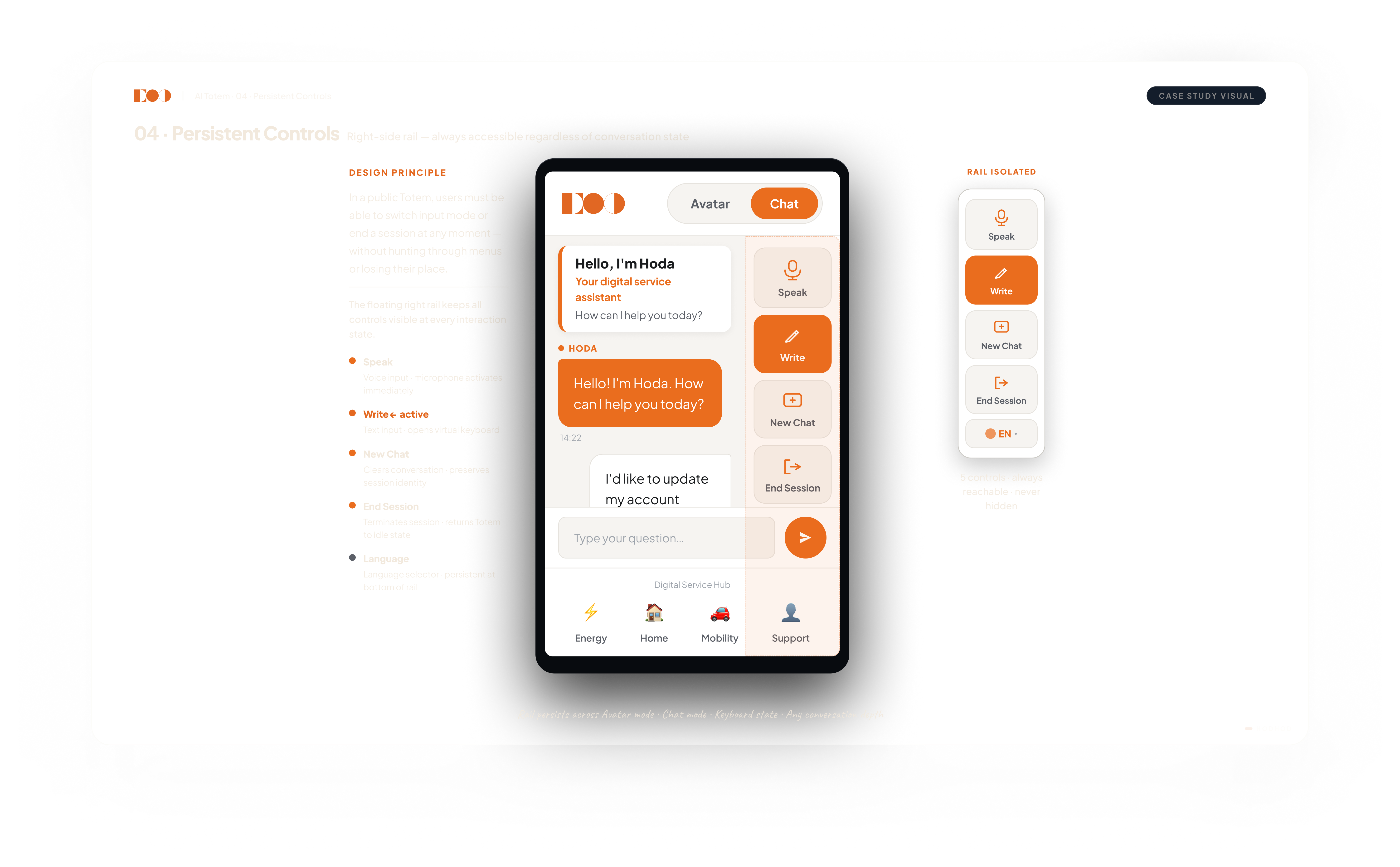
  • Keep important controls reachable in every state
  • Preserve readability and clear hierarchy in a standing kiosk setup

My Role

Designing the full public kiosk experience

I designed the kiosk arc from idle state through assistance and reset. Focus stayed on an obvious start, reachable controls, readable voice-and-text exchange, and behavior people can follow in a public setting.

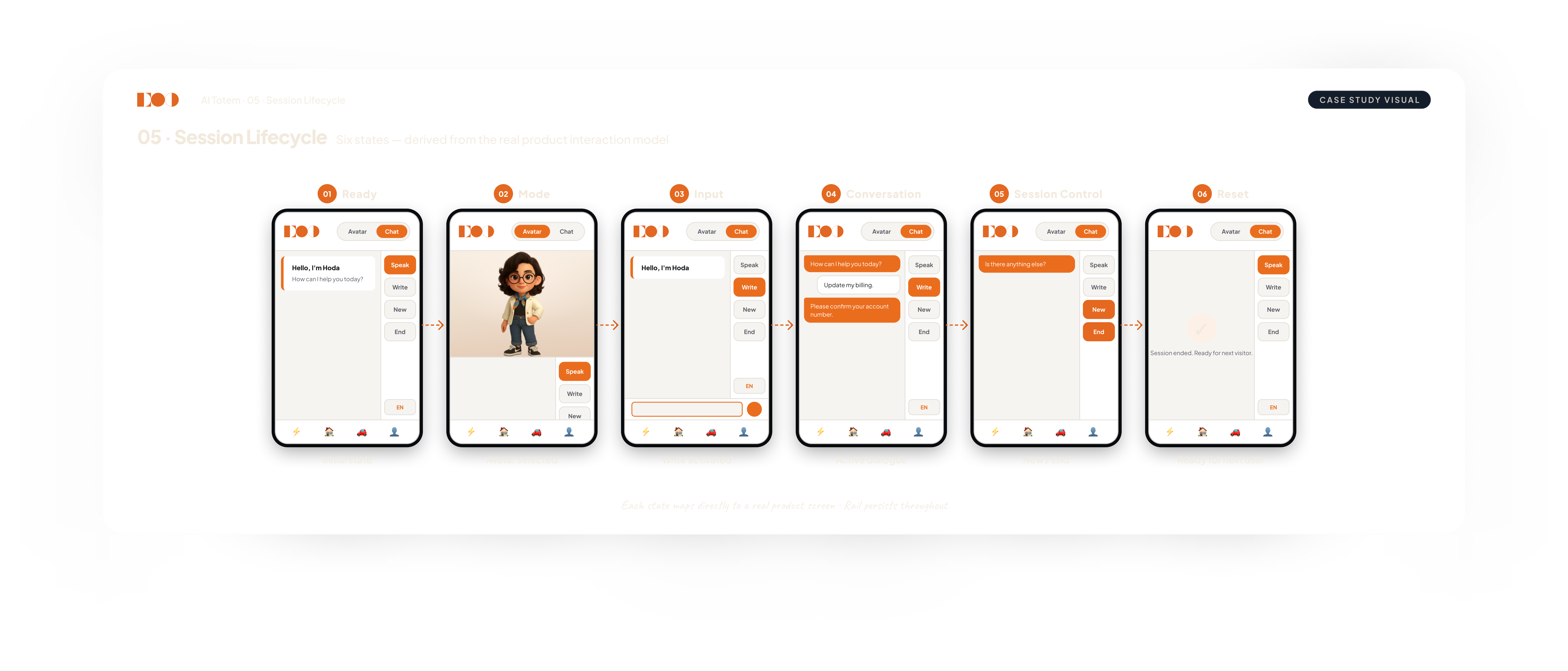
Interaction Model / Core Flow

From idle state to completed interaction

The kiosk follows a short sequence so people know what to do without learning a complex interface.

1. Signal readiness

The idle state clearly invites interaction.

2. Start in one touch

A single action begins the session.

3. Choose voice or text

Both input modes remain visible and understandable.

4. Keep next actions explicit

Fixed controls keep the current and next step clear.

5. Reset for the next user

The interface returns cleanly to the starting state.

Civic assistant flow and touch-to-start sequence concept

Key UX Decisions

Clarity before feature depth

Voice + text clarity

Voice and text stay distinct, but both follow the same start → ask → respond path.

Readable content

Short response blocks and stable hierarchy make information easier to scan.

Public-service tone

Microcopy stays direct, neutral, and suited to a public-service context.

Start-state clarity

The transition from idle to active state is explicit and visually obvious.

Public-use baseline

Touch targets, spacing, contrast, and fixed controls are sized for standing public use.

Design System / Interface Logic

One interaction language across kiosk states

The kiosk uses the same structural rules across welcome, active conversation, and guidance states so people do not need to relearn the interface as the session changes.

Civic UI adaptation across web, mobile, and kiosk states
  • Shared layouts for welcome, conversation, and guidance states
  • Consistent spacing and typographic hierarchy for readability
  • Idle, active, and reset states that follow the same rules
  • Shared control placement so important actions stay easy to find

Focus: civic clarity and a short public interaction path

Final Solution

A civic assistant that is understandable from the first touch

Idle → start → voice or text → assist → reset. Persistent controls stay available through the session.

Once someone learns how the first exchange works, the rest of the session should feel familiar.

Outcome

A public-service pattern that can travel

The structure can be reused across different public-service scenarios: the service may change, but starting, asking, responding, and resetting follow the same pattern.

See something you’d challenge?

I like talking through design decisions. If you would have approached something differently, I’d like to hear it.