CASE STUDY

Risk Assistant

A financial AI assistant that organizes risk assessment into readable phases, clearer signals, and responsible human decision support.

RoleProduct Designer
FocusFinancial UX Systems
ToolsFigma
Project visual coming soon

Project Context

Risk decisions needed clearer evidence and faster review

The product supports analysts working across company data, financial documents, and risk signals. The main requirement was to make dense information easier to interpret without flattening important nuance.

The UX Challenge

Clarify risk logic without oversimplifying it

  • Improve dashboard clarity for priority and status tracking
  • Connect document workflow with risk-scoring context
  • Design a readable assessment phase for complex data
  • Support AI recommendations with explicit analyst review
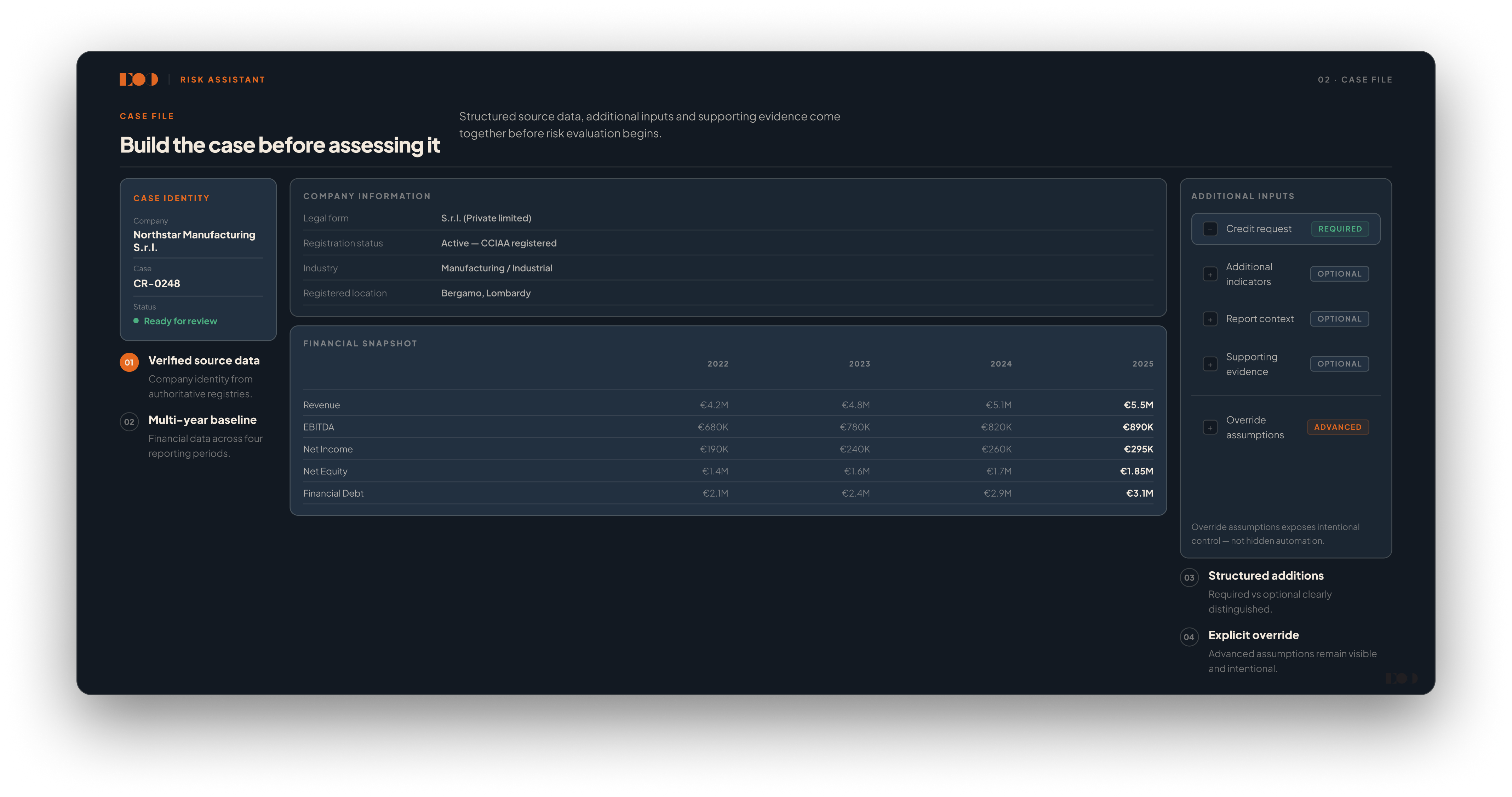
  • Create hierarchy for multi-source financial information

My Role

Building a decision-oriented interface model

I designed the risk workflow architecture, from dashboard overview to case-level review. My focus was on hierarchy, traceability, and confidence in high-stakes decision moments.

Interaction Model / Core Flow

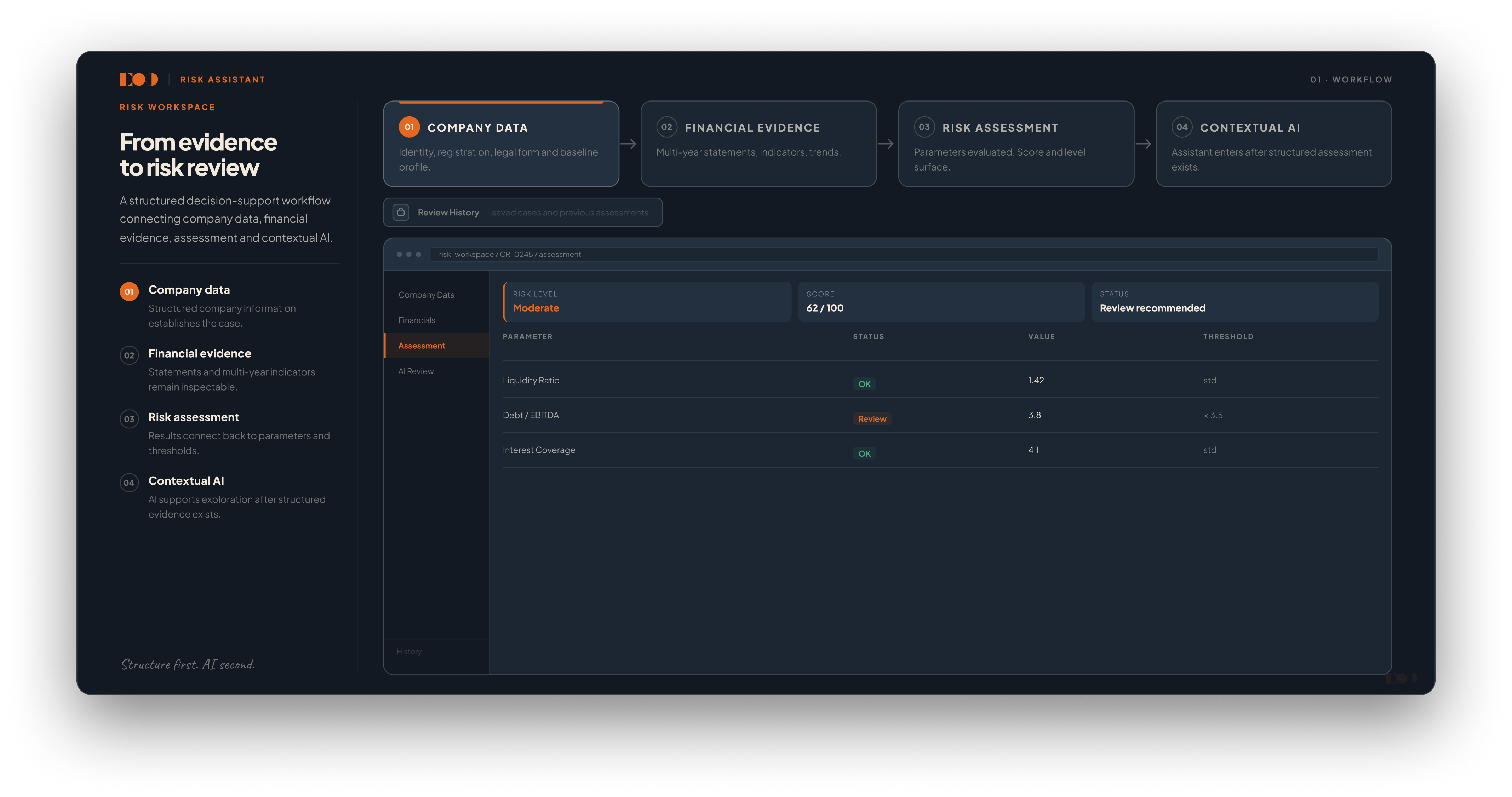
From intake to decision with traceable logic

1. Case intake

Dashboard surfaces incoming assessments with priority, status, and ownership.

2. Data and document review

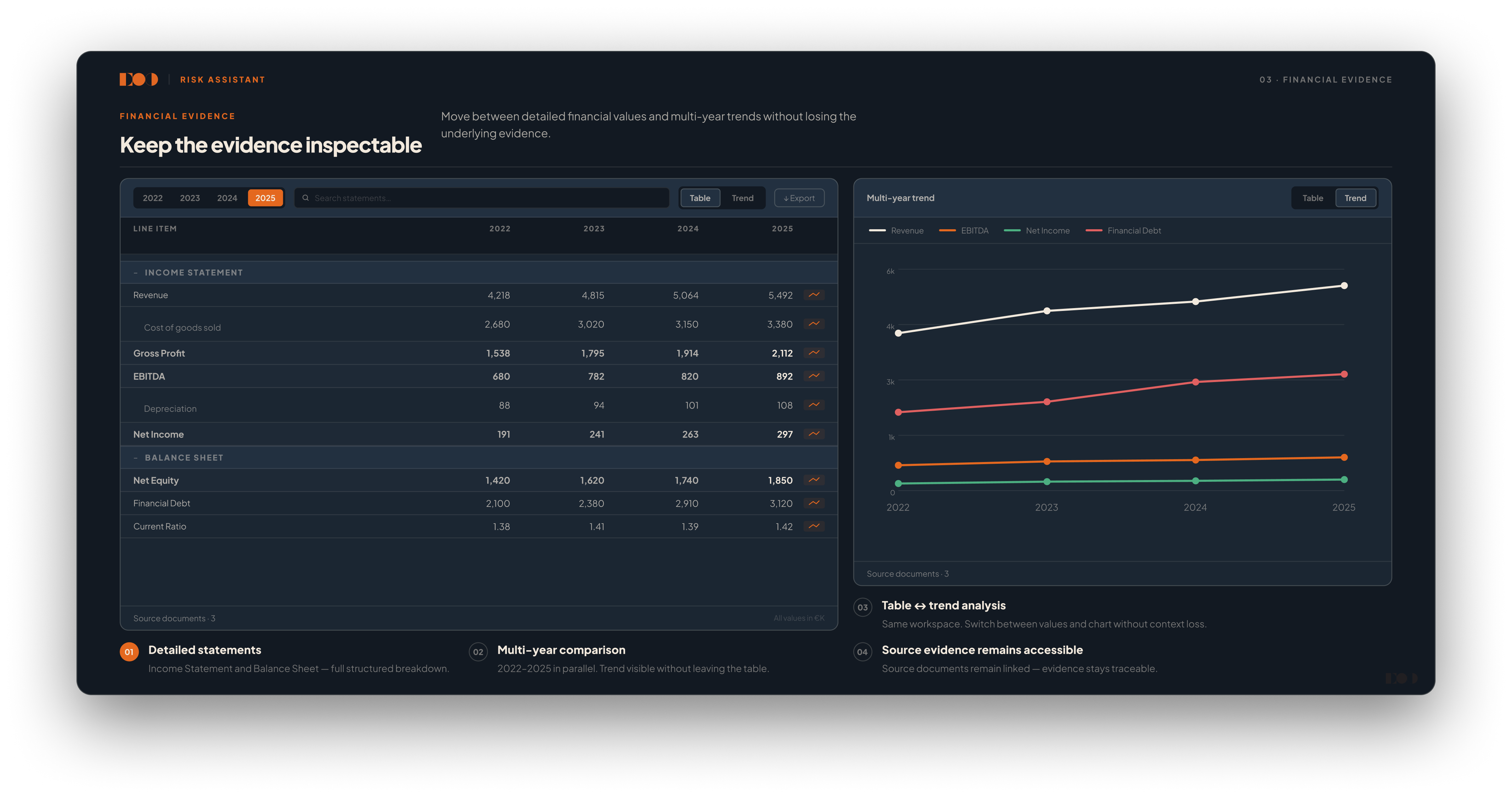
Company data and uploaded files are grouped into structured evidence panels.

3. Assessment phase

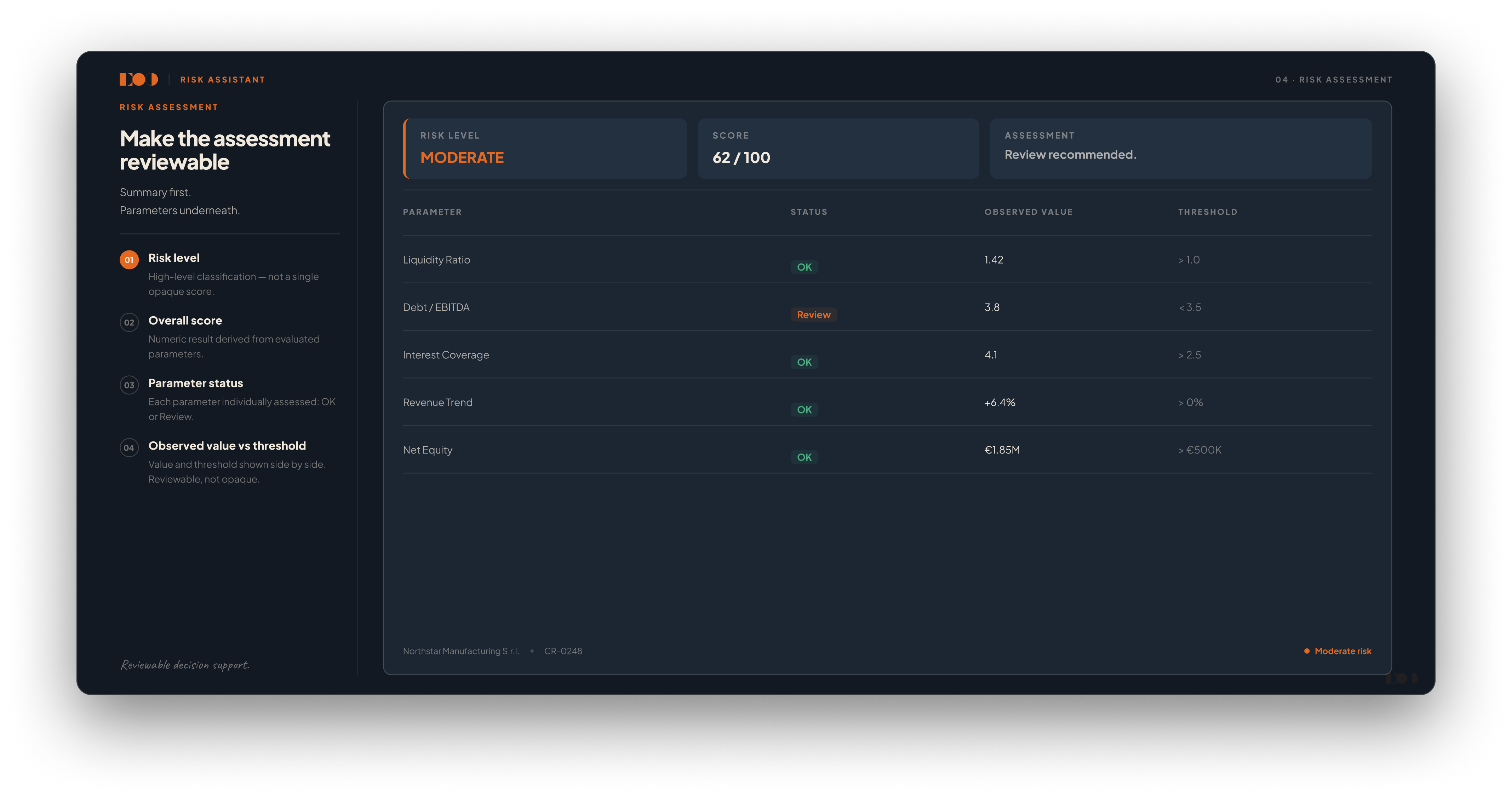
Risk factors are evaluated through layered views from summary to detail.

4. AI recommendation with rationale

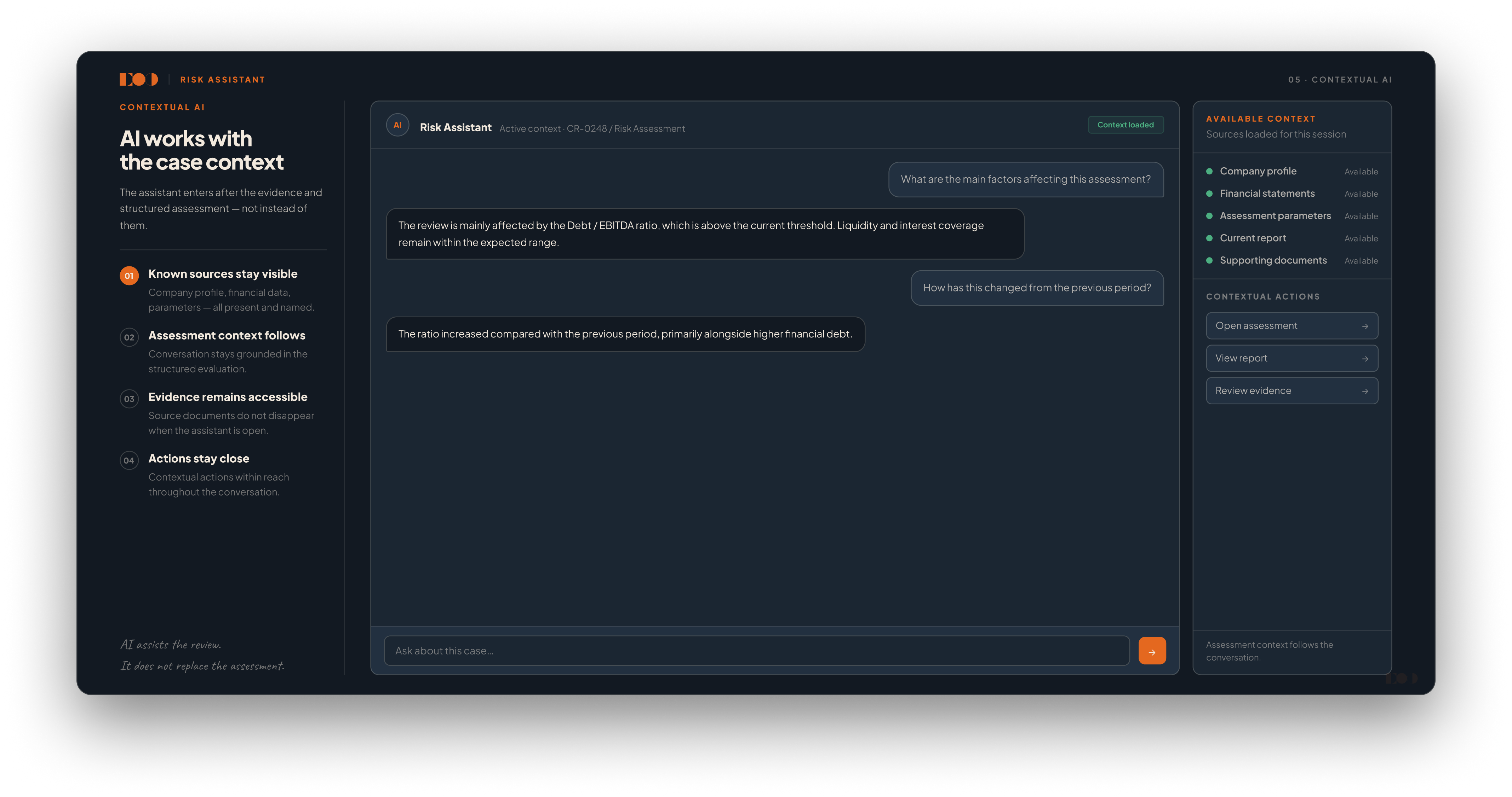
The system proposes insights while keeping reasoning visible.

5. Human decision and report

Final decisions are confirmed by analysts and captured in clear report outputs.

Project visual coming soon

Key UX Decisions

Patterns that made financial complexity manageable

Layered hierarchy

Separated quick summary from deep detail to reduce overload.

Signal grouping

Related metrics and alerts were clustered into actionable sections.

Evidence linkage

AI suggestions are always connected to visible source data.

Phase clarity

Assessment progress is explicit so analysts know current stage and next action.

Decision checkpoints

Human confirmation remains central in critical risk outcomes.

Design System / Interface Logic

Consistent components for high-information workflows

  • Reusable dashboard cards for risk state, urgency, and assignment
  • Standardized data tables and document panels across phases
  • Shared visual language for warnings, confidence cues, and statuses
  • Stable spacing and typography hierarchy for dense information
  • Clear states for loading, review, and approval transitions
Project visual coming soon
Focus area: making complex financial data readable and actionable

Final Solution

A structured risk-assessment workspace

The final interface guides analysts through dashboard review, document checks, assessment, and reporting without hiding key evidence.

Risk reviews became easier to compare, explain, and document.

Outcome

Clearer decisions across every phase

The workflow reduced ambiguity during analysis and improved handoff because states and component behavior stayed consistent.