CASE STUDY

AI Assistant Widget

Multi-platform conversational interface designed for web, mobile, and kiosk environments.

Role UI & UX Designer
Tools Figma
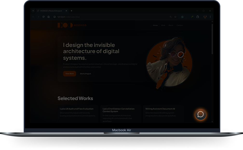
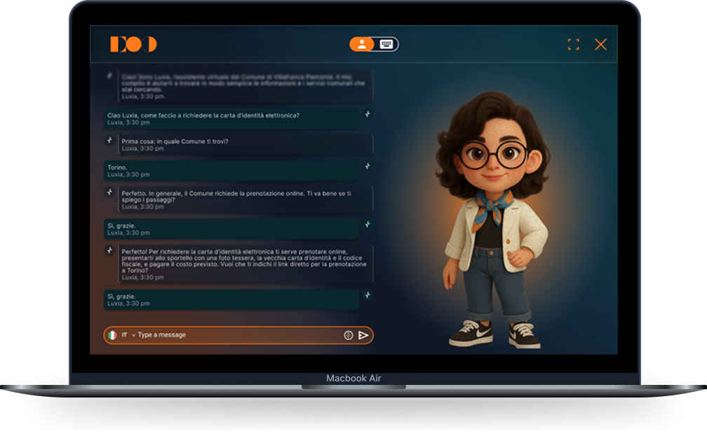
AI Assistant Laptop Mockup

Project Context

This concept explores how an assistant can stay helpful without hijacking the main task. The experience starts small and expands only when deeper work is needed.

Challenge

  • Keep the assistant available without becoming disruptive
  • Define clear transitions between entry, overlay, and immersive modes
  • Keep behavior consistent across web, mobile, and totem contexts
  • Reduce complexity while preserving useful AI capabilities

My Role

I led the interaction and interface design for the assistant experience, focusing on how the system should behave across different levels of engagement.

Interaction States

The assistant moves from quick access to deep workspace in clear steps, so users keep context while engagement grows.

Bubble state preview

Bubble

  • Non-intrusive entry point
  • Always accessible while browsing
  • Clear invitation to expand
Overlay state preview

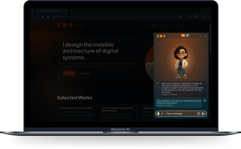
Overlay

  • Context-preserving conversation layer
  • Balanced focus between task and assistant
  • Fast switching between browsing and chat
Fullscreen state preview

Fullscreen

  • Immersive mode for longer interactions
  • More room for tools, history, and deeper tasks
  • Supports extended assistant workflows

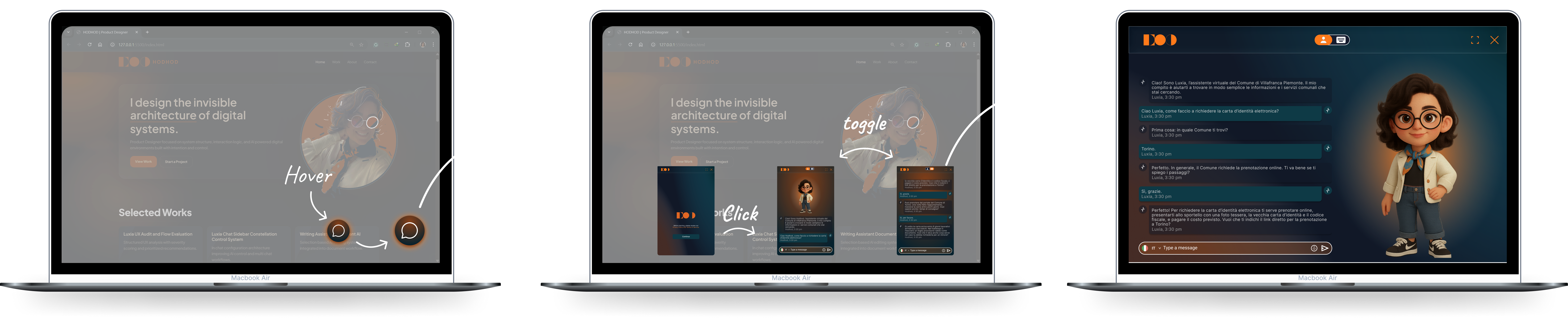
Interaction Flow

The flow shows how the assistant grows from an optional bubble into an overlay and finally into a full workspace, depending on user need and task depth.

AI assistant interaction flow from bubble to overlay to fullscreen

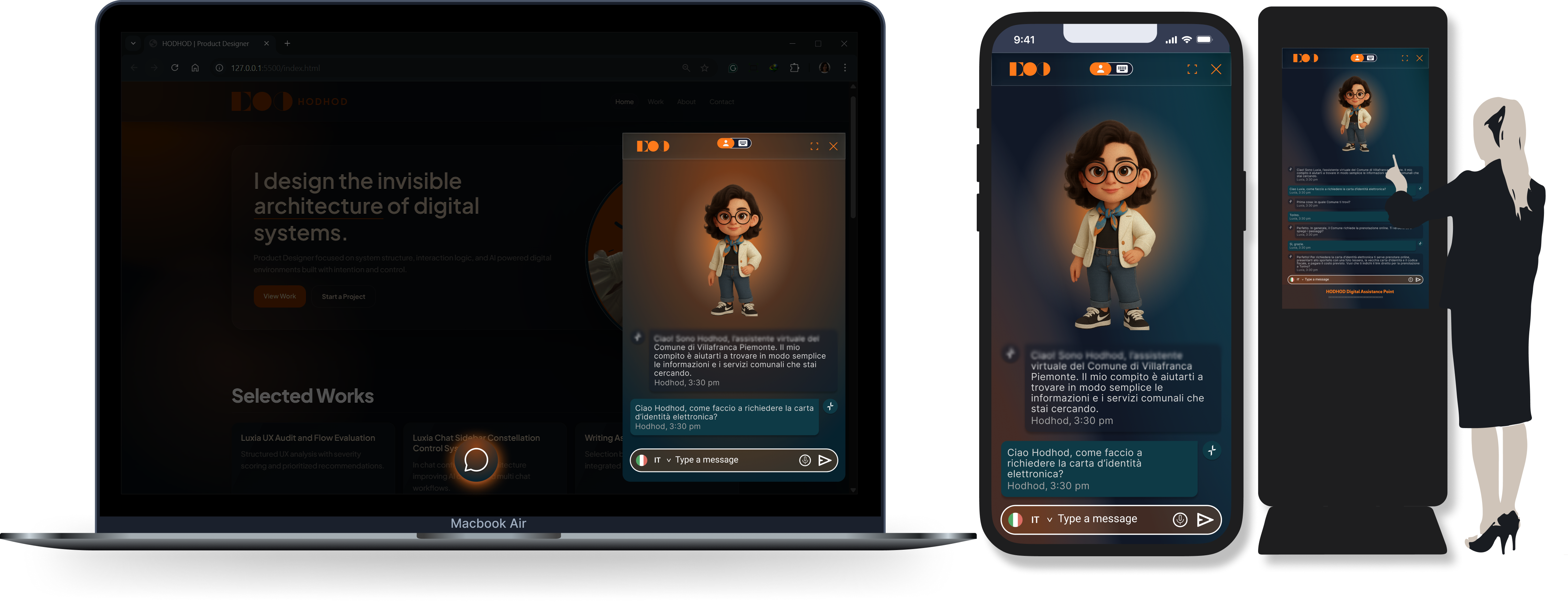
Platform Adaptation

The assistant is designed as one coherent system that adapts to different environments while preserving the same logic, tone, and interaction effort.

Platform adaptation across web, mobile, and totem environments

Web

  • Floating bubble entry point
  • Expandable overlay chat
  • Fullscreen interaction mode
  • Flexible task switching inside desktop workflows

Mobile

  • Direct full-interface layout
  • Responsive spacing and compact hierarchy
  • Consistent behavior patterns
  • Touch-first controls and readability

Totem

  • Split avatar and chat structure
  • Touch-optimized interactions
  • Clear visibility for public use
  • Accessible layout at standing distance

Process

I mapped the assistant as a progressive system: small at entry, deeper when needed. That clarified state transitions, hierarchy, and focus behavior.

Key UX Decisions

  • Progressive disclosure — starts small and expands only when needed
  • Context preservation — overlay mode keeps the main environment visible
  • State-based interaction model — bubble, overlay, and fullscreen each serve a clear level of engagement
  • Cross-platform consistency — one system adapted for web, mobile, and totem contexts

Final Solution

  • Created a progressive assistant model that starts as a subtle entry point and expands when needed
  • Maintained clarity through distinct states and predictable transitions
  • Created a system that can grow with future capabilities and deeper workflows
  • Improved the experience of moving between lightweight assistance and deeper task completion

Outcome

Users can stay in task context while the assistant helps at the right moment, without interrupting flow. The team also gained a repeatable interaction pattern for future releases.